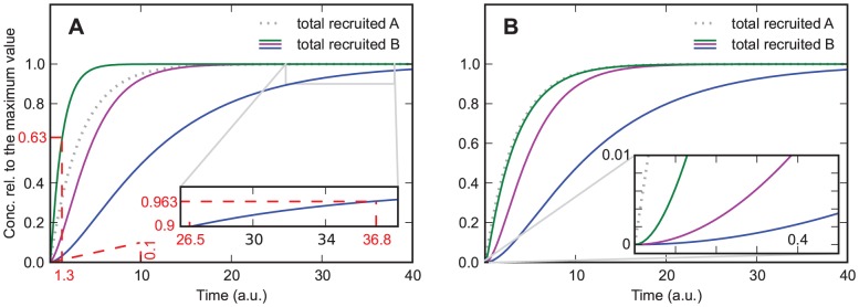
Figure 2. Model in which protein  increases the association rate of protein
  .
.  and
and  from bottom to top curve.

A)  . Solid lines are for protein
  , the dotted line is for protein
  , and the dashed lines are used for estimating the order of magnitude of the rate constants from the curves, giving
  for the steepest curve, and
  and
and  for the slowest curve. Depending on the parameters the curves show an increasing slope at the beginning. B) same parameters as in A) except
  . The curves always show an increasing slope at the beginning, which helps distinguishing this case from the one shown in Figure 2A. Additionally, for large values of
  the recruitment curves of
  resemble the recruitment curve of
  , which is not the case if
  .
.
