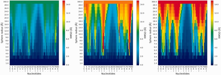
Figure 5.
2D map plot—each map corresponds to exactly one of the analyzed models (left—Chen_model_1, center—Major_model_2 and right—Das_model_3); X-axis represents the sequential order of nucleotides; Y-axis represents the sphere radius; color of the cell represents the RMSD value, following the scale presented at the bottom (blue—low RMSD and high prediction quality, red—high RMSD and low prediction quality).

