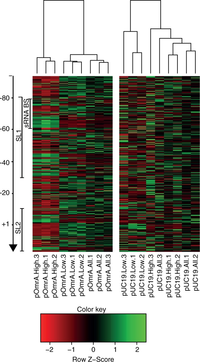
Figure 4.

Differences in mutation pattern between different samples. Each column in the heatmap represents the mutation pattern of one sample. Each sample is named according to the plasmid it carried (pOmrA or pUC19), which bin it was sorted into (high, low or all) and which biological replicate it represents (1, 2 or 3). The dendogram on top of the heatmap shows the hierarchical clustering of similarities in the mutation patterns between the different samples. Each row in the heatmap represents one mutation, e.g U-75A, and each cell is colored from red (under-represented compared with the other cells in the same row) to green (over-represented compared with the other cells in the same row). Both stem-loops (SL1 and SL2) and the sRNA binding region (sRNA BS) are indicated by bars on the left.
