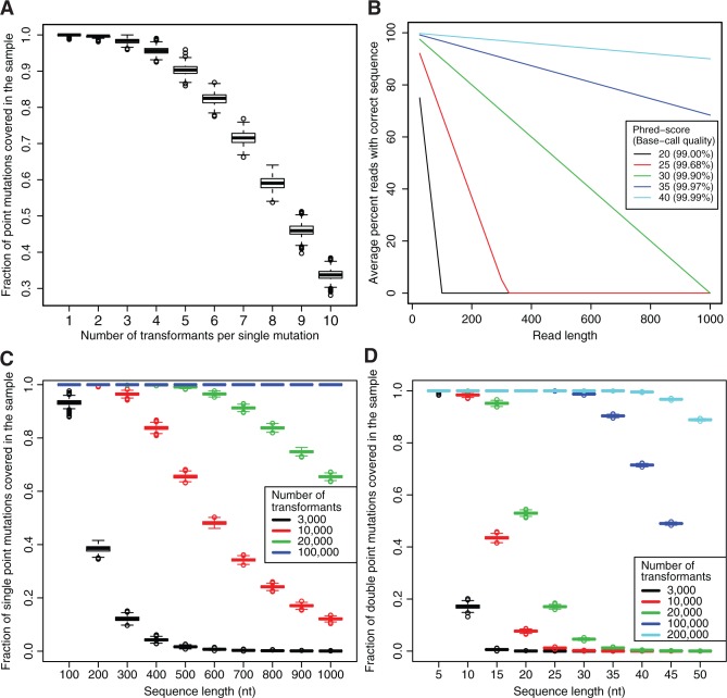
Figure 6.
Mutation distribution simulations. (A) Simulated data of 1000 runs on single mutation random mutagenesis of 3000 transformants with a 109 nt sequence represented with boxplots. Each boxplot represents the distribution of the fractions of single mutations covered (y-axis) as a function of the number of times it has to occur (x-axis). (B) Average percentage reads of correct sequence depending on different Phred-scores (base call accuracy in parentheses). (C) Simulated data of 1000 runs on single mutation random mutagenesis. Each boxplot represents the distribution of the fractions of single mutations covered (y-axis) at least five times as a function of sequence length (x-axis). The different colors represent different numbers of single mutation transformants. (D) Simulated data of 1000 runs on double mutation random mutagenesis, plotted as in (C), but all symbols here refer to double mutation transformants.

