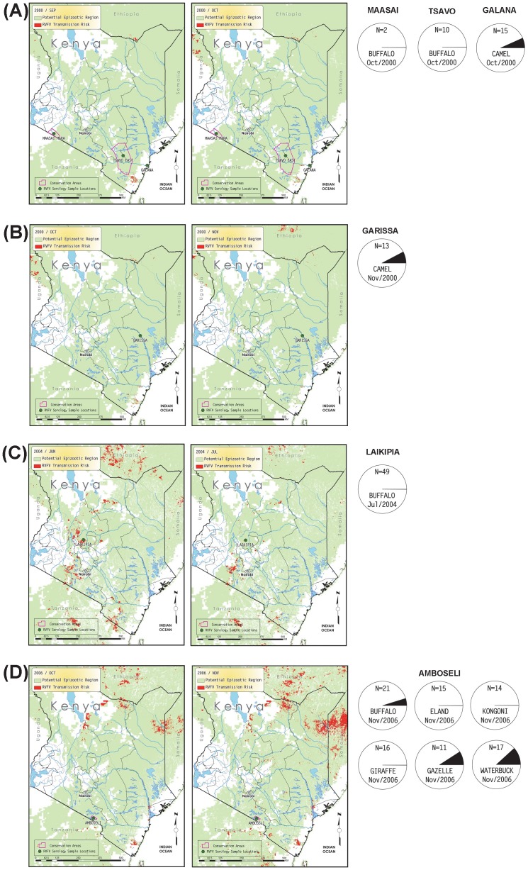
Figure 4. Monthly predicted RVF risk assessment map overlaid with serological results collected prior to the 2006–2007 RVF outbreak; A) Tsavo East in September and October 2000, B) Garissa in October and November 2000, C) Laikipia in June and July 2000, and D) Amboseli in October and November 2000.
The light green background color shows the extent of the potential epizootic region and high risk is indicated by red color in 1 km2 pixels. Magenta lines represent polygons for conservation areas such as national parks or preserves. For each sample month, the left-hand map shows the RVF risk conditions for the prior month, and the right-hand map shows the month the samples were taken, along with sample locations. Below the maps for sample months, pie charts show the proportion of samples found to be RVF seropositive for each species, by location. Only locations sampled in that month are plotted.

