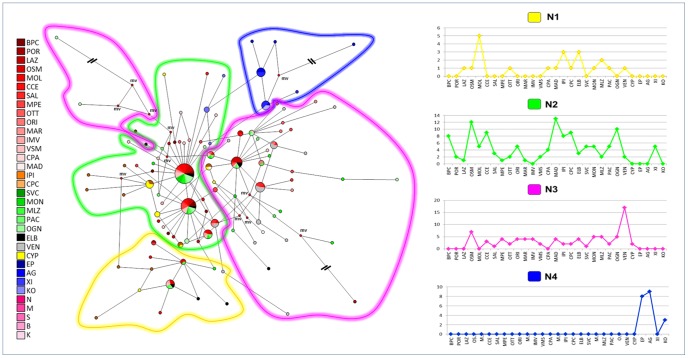
Figure 7. COI-16S dataset: network analysis.
Median-joining network (on the left) with haplotypes grouped according to the results of the Bayesian assignment. Small red plots on the nodes, labelled as “mv”, show median vectors, representing hypothetic connecting sequences, calculated with a maximum parsimony method. The long branches leading to isolated haplotypes were shortened and indicated with “\\”.The x axis reports populations and the y axis the absolute frequency of distribution. The populations are labelled as reported in Table 1. The number of mutations on the network branches are reported in the Figure S2.

