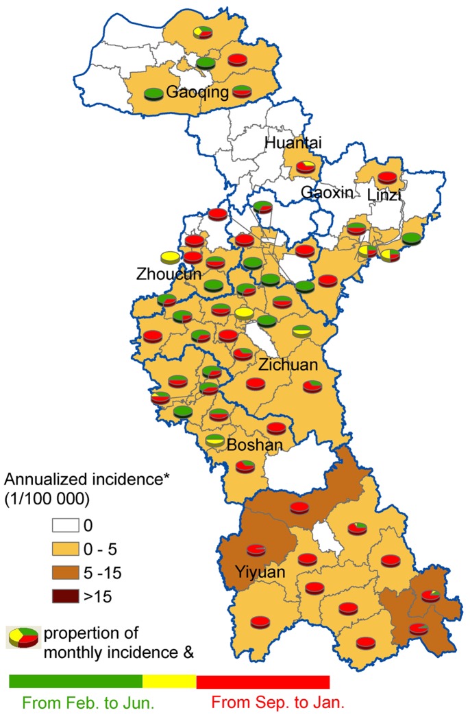
Figure 4. The spatial distribution of HFRS incidence and their proportion of monthly incidence in each town.
The background of map with color gradient presents the annual incidence of HFRS, and pie graphs display the proportion of monthly incidence for each town. Towns in white on the map have zero incidences. * Average annual incidence per 100 000 populations. & Proportion of average monthly incidence in these pie graphs, where green color indicates the proportion of average monthly incidence from February to June (in spring and early summer), yellow is the proportion of average monthly incidence from July to August (in summer), and the red represents the proportion of average monthly incidence from September to January (in autumn and winter).

