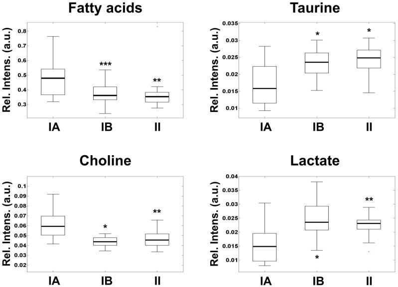
Figure 1. Box-and-whisker plots showing the levels of metabolic aggressiveness representative metabolites in benignA (box in the left), benignB (box in the middle) and atypical (box in the right) meningioma.
Relative intensity levels are calculated as peak area normalized to total spectral area and expressed in arbitrary units. The boxes limits represent the lower and upper quartile limits. The median has been represented as a thicker line within the box. The whiskers are lines extending from each end of the boxes to show the extent of the rest of the data. Statistical significance with respect benignA levels are marked with stars (*, p<0.05; **, p<0.01; ***, p<0.005).

