
Fig. 2.
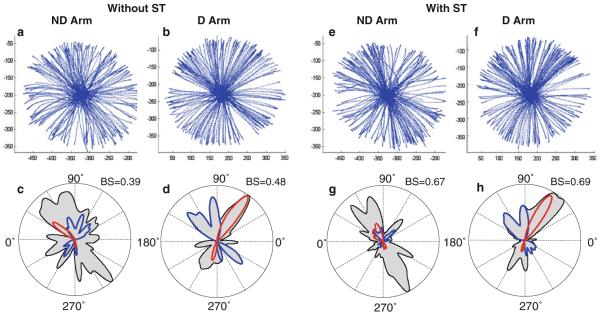
An example of strokes and corresponding circular histograms obtained from a representative subject. Data obtained from the D and ND arm without and with the secondary task are shown. The histograms represented by the contours of the gray areas demonstrate the frequency of stroke production in each direction for each subject. Peaks of these contours represent preferred directions. Bias strength (BS) is shown for each histogram. The histograms are overlapped with traces, representing the directional histograms of strokes optimized according to IINTE (blue) and IINTS (red). If a color trace closely follows a peak of the gray area, this indicates that the majority of strokes in this preferred direction were optimized with respect to the corresponding cost function. Here and in the other histograms, 0° denotes the lateral direction away from the body midline and 90° denotes the anterior direction away from the body