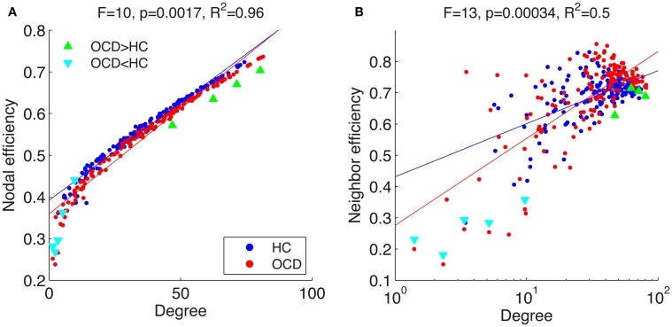
Figure 8.
Mean nodal efficiency (A) and neighboring efficiency (B) are shown over mean degrees in a linear (A) and a logarithmic (B) scale. Each point indicate an ROI from the networks of the healthy controls (HC, blue dots) and patients with OCD (OCD, red dots). Specific ROIs with significant group differences in efficiency measures are marked with either green triangles ( ) or cyan triangles (
 ). Regression lines are given for each group (HC, blue line; OCD, red line). Above panels, F-statistic and p-value for a GLM testing the interaction between logarithm of degree and group and R2 for the full model are given.

