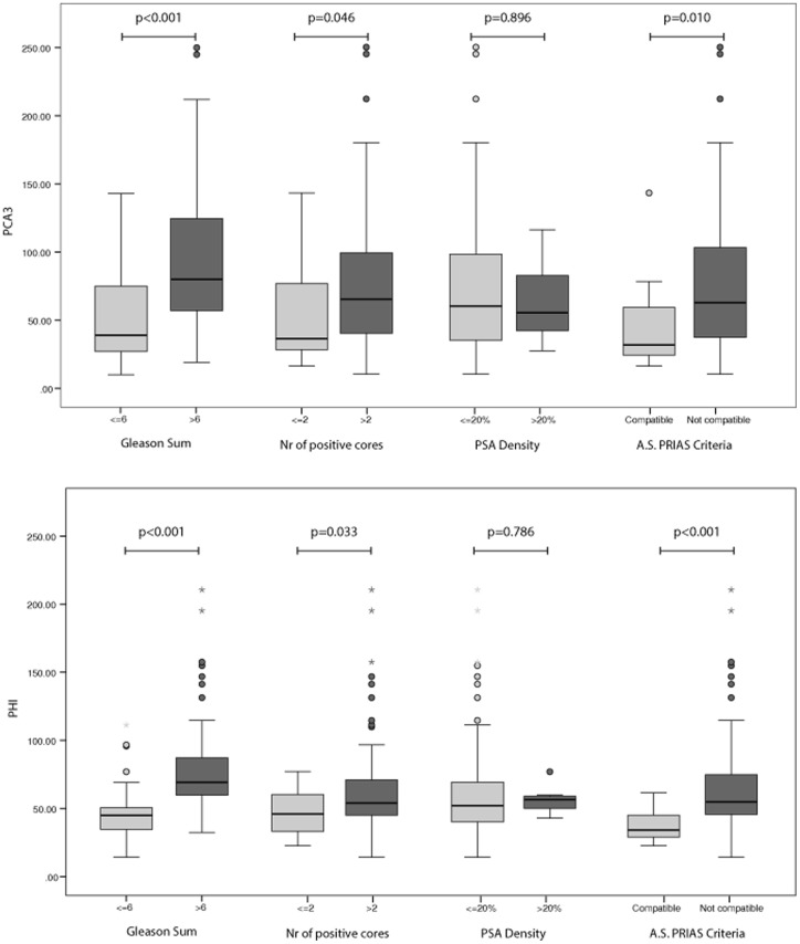
Figure 3. PCA3 and phi ability in discriminating PCa according to PRIAS criteria.
Box plot shows the distribution of PCA3 values (upper panel) and phi values (lower panel) in patients with biopsy proven PCa classified according to the PRIAS criteria for active surveillance. Data are shown as median (horizontal line in the box) and Q1 and Q3 (borders of the box). Whiskers represent the lowest and the highest values that are not outliers (i.e., data points below Q1–1.5x IQR or above Q3+1.5x IQR) or extreme values (i.e., data points below Q1–3xIQR or above Q3+3xIQR). Dots represent outlier values and asterisks represent extreme values. Q1 = 25th percentile; Q3 = 75th percentile; IQR (interquartile range) = Q3–Q1.

