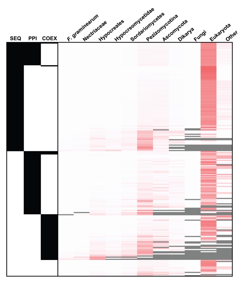
Figure 1. Heat map displaying the taxonomic distribution for each of the predicted virulence associated proteins.
Each row provides the information for one sequence. The left hand three columns (SEQ, PPI, COEX) indicate the network in which the prediction could be made (black). For the bottom 15 rows only the integrated network provides the prediction. The right hand heatmap shows the proportional distribution of all BLAST hits from the 215 predictions to the NCBI nr database (white – lowest, red - highest) across the taxonomical levels. All hits were counted once, at the lowest possible level of taxonomical specificity. The grey colour shows cases where there were no hits at a particular taxonomic level. See Table S2 for the detailed results for each individual FGSG protein.

