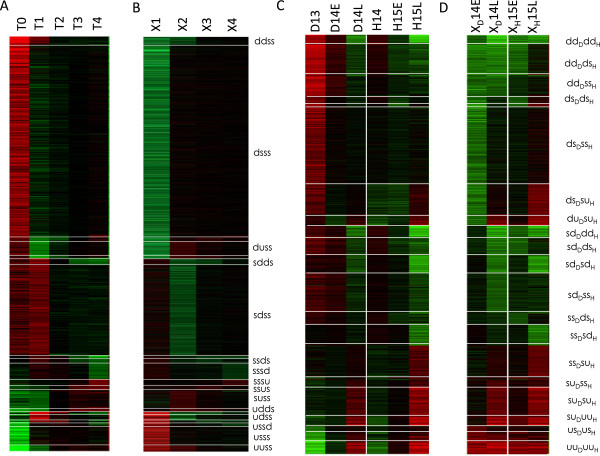
Figure 3.
Clusters from discrete transition profiles. Heat maps representing transcriptome data from Pilot et al. (A,B) and Lu et al. (C,D). Panels (A,C) show gene-wise normalized time points (log-ratios of each time point relative to the gene-wise median), whereas (B,D) show the corresponding transitions between successive time points. Color scheme: red: positive values, green negative values: black: null values.

