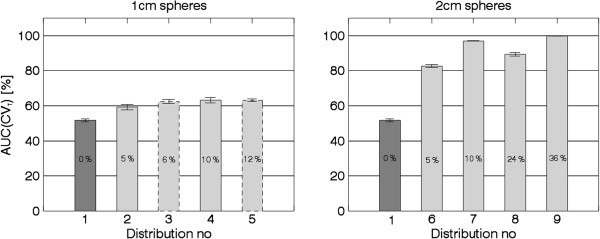
Figure 3.

The mean AUC(CVT) value for each activity distribution as listed in Table1. The dark grey bars show simulated normal, and the light grey bars show simulated COPD. Bars with dashed outline correspond to clustered distributions. The total reduction of ventilation for each distribution is written in the bars. The error bars show a 95% CI, based on the 20 noise realisations.
