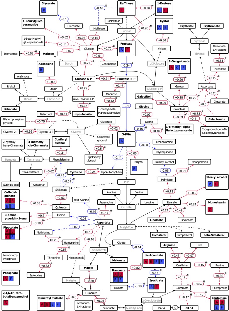
Figure 6.
Pathway map of the primary metabolism showing genetic correlations between metabolites detected in the DH population. Edges with positive genetic correlations are displayed in red, whereas edges with negative genetic correlations are displayed in blue. Corresponding correlation values are placed next to the edges, and significant correlations (P < 0.05) are marked with asterisks. Metabolites colored in pale gray were not measured in this study. Metabolites with mapped QTLs are displayed in boldface, and colocalizations with agronomic traits are visualized using boxes A to F; red boxes indicate a positive genetic correlation, and blue boxes indicate a negative genetic correlation, of the metabolite with the agronomic traits of this particular cluster (according to the clusters of agronomic traits in Fig. 3). Boxes are as follows: A, leaf rolling, screening L2.2, grain size G2.2, glaucousness, thermal time to heading, days to senescence; B, tiller number, number of aborted tillers, head length, crown rot symptom severity; C, chlorophyll content, fertile spikes per seed, grain size G2.8, total seeds per spike; E, grains per m2, grain yield; F, harvest index, peduncle length, flag leaf length, test weight, thousand grain weight, spikes per m2. The image was made using a modified author-created pathway map in VANTED (Junker et al., 2006).

