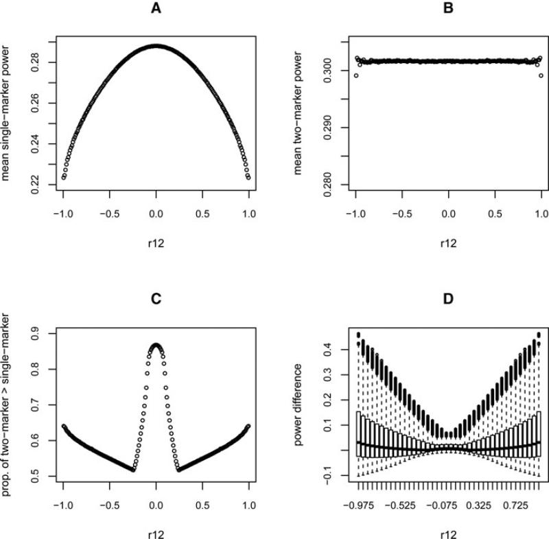
Fig. 1.
Summary of power from the first simulation (with type I error 0.05, causal RR 1.2, and sample size 2,000). The x-axis is the correlation between the two markers (ρ12). (A) The mean of the test power for each set of correlations corresponding to a small bin of ρ12 values using single-marker tests. (B) The mean power using two-marker tests. (C) The proportion of tests where two-marker tests have greater power than single-marker tests for each ρ12 bin. (D) Box plots showing the distribution of the difference in power between the two-marker and single-marker tests for each ρ12.

