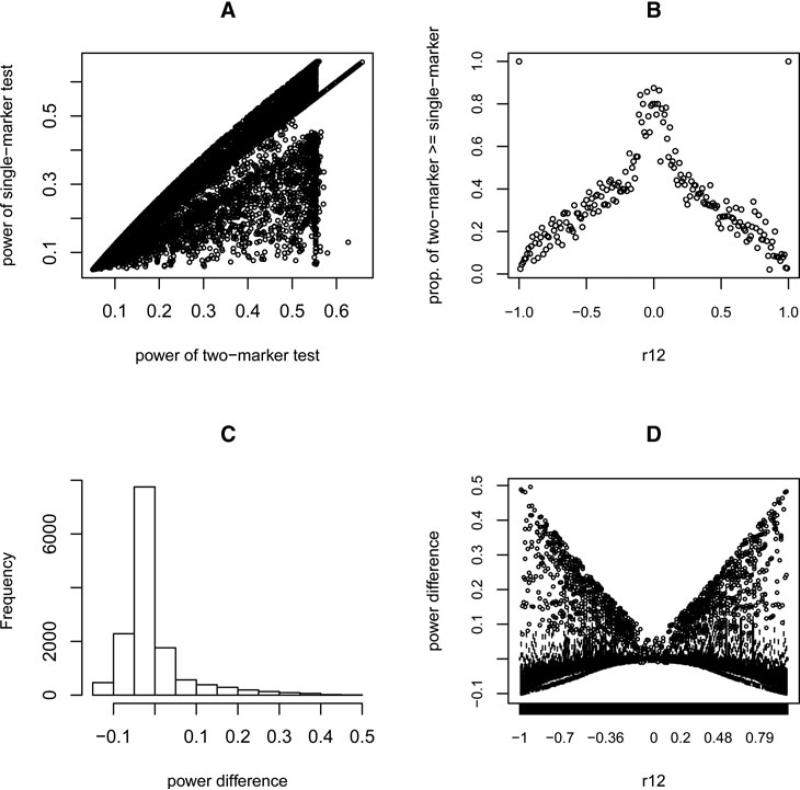
Fig 3.
Results of a power comparison using the correlations calculated from HapMap data. (A) Scatter plot of power of two-marker tests vs. single-marker tests (each point represents an individual simulated case). (B) The proportion of tests where the two-marker test has greater power than the single-marker test for each fixed range of ρ12. (C) Histogram of power difference between the two-marker test and the single-marker test over all simulated cases. (D) Box plots showing the distribution of the difference in power between the two tests for each small fixed range of ρ12.

