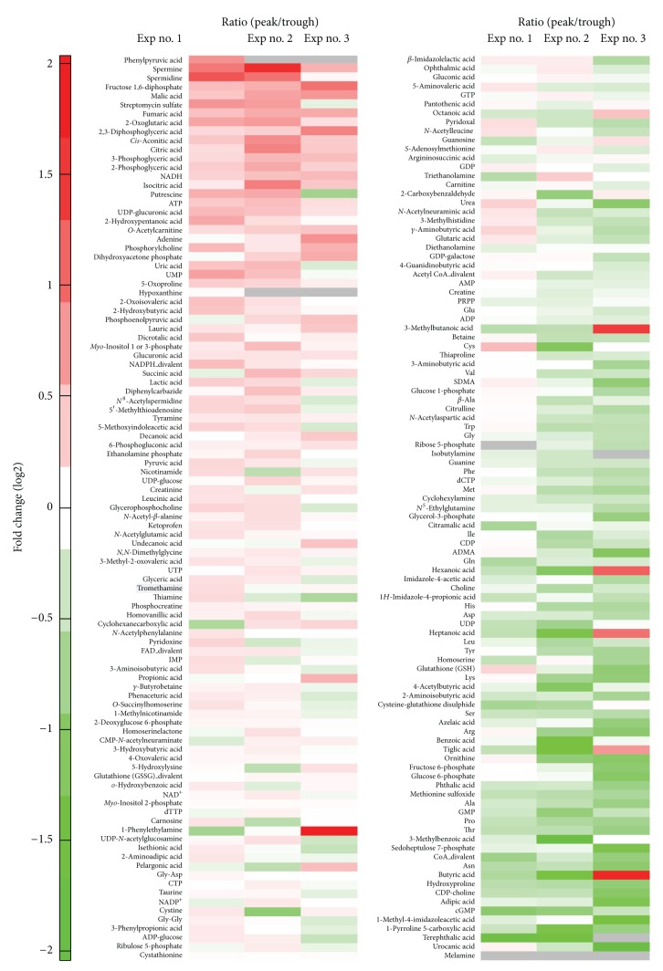
Figure 3.
The result of the metabolite analysis is illustrated in a heatmap, which represents the fold change of metabolite concentrations in peaks of PACTIN-PxRe oscillations compared with those in troughs of PACTIN-PxRe oscillations. Data are from three independent experiments (Exp nos. 1–3). Gray means the case in which the metabolite was undetected in peak or trough of PACTIN-PxRe oscillations.

