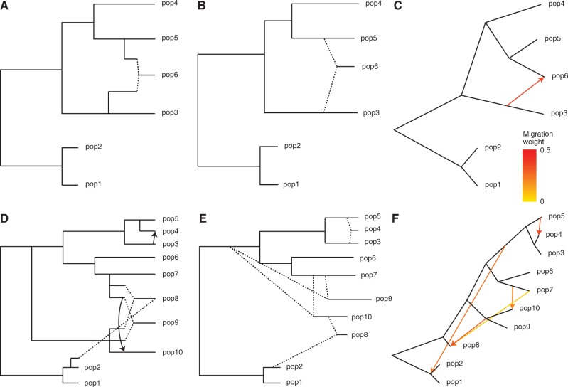
Fig. 3.
Results with simulated data. (A–C) First simulated admixture tree, with one admixed population. Shown are (A) the true phylogeny, (B) MixMapper results, and (C) TreeMix results. (D–F) Second simulated admixture tree, with four admixed populations. Shown are (D) the true phylogeny, (E) MixMapper results, and (F) TreeMix results. In (A) and (D), dotted lines indicate instantaneous admixtures, whereas arrows denote continuous (unidirectional) gene flow over 40 generations. Both MixMapper and TreeMix infer point admixtures, depicted with dotted lines in (B) and (E) and colored arrows in (C) and (F). In (B) and (E), the terminal drift edges shown for admixed populations represent half the total mixed drift. Full inferred parameters from MixMapper are given in supplementary table S1, Supplementary Material online.

