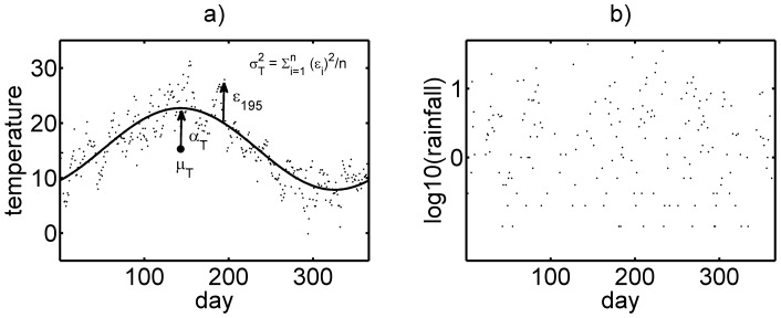
Figure 1. Representative plot of (a) Daily temperature in the Oxford study area over one year from 1st March 2000; demonstrating a clear sinusoidal seasonal trend.
The solid line represents the effect of yearly mean temperature,  , combined with temperature amplitude,
  , in 2000. Some variance around the predicted temperatures (the solid line) is evident, defined as
  (b) Daily rainfallover the Oxford study area over one year from 1st March 2000. No seasonal trends were apparent. The year 2000 was taken as an example and while there is inter-annual variation, other years followed the same general temperature and rainfall patterns.

