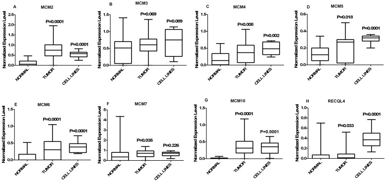
Figure 1. Graphical representation of normalized expression values.
(A–H) Box plots representing the distribution of normalized expression values of normal (n = 30), tumor (n = 60) and CC cell lines (n = 8). A box in a given box plot represents the interquartile range (25th percentile to 75th percentile), the middle line denotes median and the extreme ends of the whiskers marks the minimum and maximum values. P-values indicated over each box represent the asymptotic significance (2-tailed) of Mann-Whitney test comparing normal to tumor and normal to cell lines independently.

