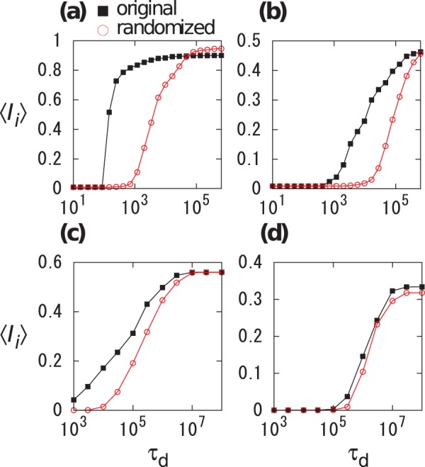
Figure 3. Average final infection size  for (a), (b) Conference and (c), (d) Email data sets.

Squares and circles correspond to the original and randomized temporal networks, respectively. We set (a)  , (b)
, (b)  , (c)
, (c)  , and (d)
  .
.
