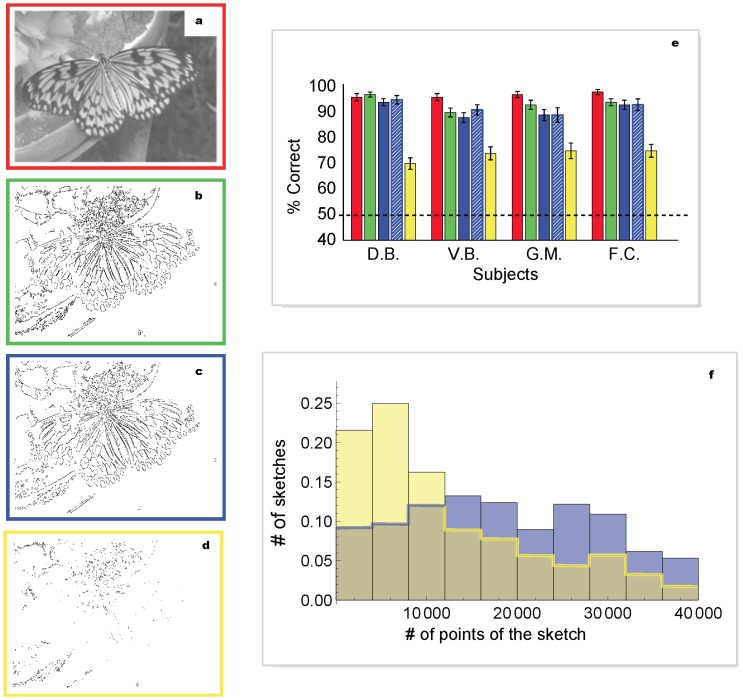
Figure 5. Examples of sketches obtained from different pattern sets.
a, Original 256 grey-levels image. b, Sketch obtained from the optimal pattern set of fig. 3b. The corresponding compression factor is 40, and its information content is 9.8% of the original. c, Sketch obtained from the optimal pattern set of fig 3c. The corresponding compression factor is 67 and its information content is 5.5% of the original. d, Sketch obtained from the 244 low-probability pattern set (fig. 3d shows a sub-sample); information (5.5%) and compression (factor 90) are similar to (c). e, Percentage of correct discrimination for sketches obtained as in (b), (c), (d) (green, blue, yellow bars respectively) and 256 grey-levels images as controls (red bars), for four subjects. The striped blue bar represents results obtained from the same dataset shown in blue, after reweighting the data to match the distribution of the number of patterns of the yellow dataset. f, Distributions of the number of points found in the sketches for the two sets in (c) and (d), shown with the same color code. The distributions are taken over the entire image database of our study. Each data point represents 300 trials. The black dashed line indicates chance performance. Error bars are s.d. The results of pairwise statistical comparisons (binomial tests) amongst performances plotted in (f) are: red vs. green: D.B. p = 0.96, V.B. p = 0.06, G.M. p = 0.16, F.C. p = 0.13; red vs. blue: D.B. p = 0.48, V.B. p = 0.009, G.M. p = 0.003, F.C. p = 0.08; blue vs. green: D.B. p = 0.3, V.B. p = 0.7,G.M. p = 0.3, F.C. p = 0.9; blue vs. yellow: D.B. p = 9.8*10−12, V.B. p = 2*10−5, G.M. p = 0.002, F.C. p = 1.1*10−7.

