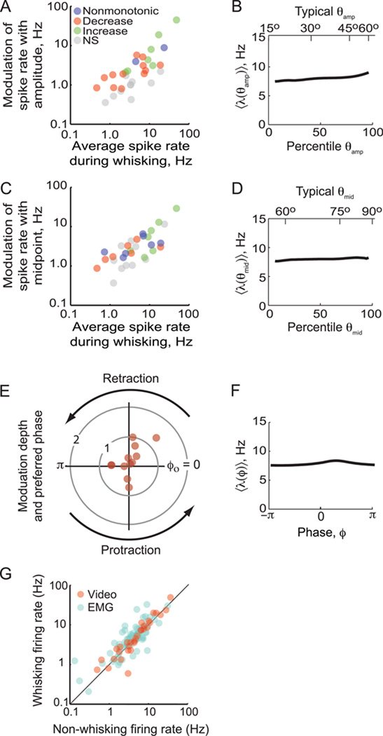
Figure 5. Summary of the coding of fast and slow time scales by single units.
(A) Scatter plot of the modulation depth, defined as the maximum rate minus the minimum rate, for amplitude versus mean spike rate for each unit (N = 31). DIfferent colors distinguish increasing versus decreasing spike rate with an increase with angle, as noted. (B) The mean tuning curve for amplitude across the population. Data for slow variables were transformed into percentiles before averaging, as different vibrissae show distinct ranges of amplitude. The upper scale is the average angle for a given percentile (Fig. 3D). (C) Scatter plot of the modulation depth for midpoint versus mean spike rate for each unit (N = 31). (D) The mean tuning curve for midpoint across the population. The upper scale is the average angle for a given percentile (Fig. 3D). (E) Polar plot of the normalized modulation depth, defined as the maximum rate minus the minimum rate divided by the mean rate, as a function of the preferred phase for the unit, ϕo. Only points for significantly modulated units are plotted (N = 12). (F) The mean tuning curve as a function of phase across the population. (G) Firing rate of all units during whisking behavior recorded by videography (N = 32) or through the |∇EMG| (N = 69).

