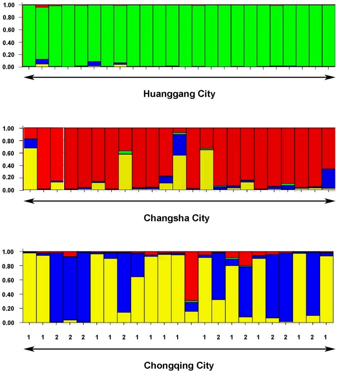
Figure 2. Assignment of individuals (each representing a colony) sampled from three cities to genetic clusters.
Columns represent colonies, each color represent a different genetic cluster defined by STRUCTURE (K = 4). The colors in each column represent the likelihood with which a colony is assigned to each genetic cluster. The numbers (1 and 2) in this figure represent the colonies assigned to the Chongqing-1 population and the Chongqing-2 population, respectively.

