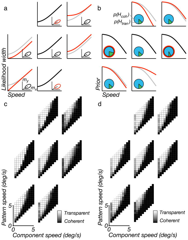
Figure 4.
Model simulations for different parameter settings. (a) Illustration of seven different settings for the likelihood parameters. The black line in the central log–log plot shows the default width of the speed likelihood as a function of speed. The inset plot shows the default shape of the measurement distribution (see Figure B1a), thus illustrating the relationship between speed and direction uncertainty. Each of the surrounding six log–log plots and insets shows a variation of one of the three likelihood parameters, as highlighted in red (default values are redrawn from the center plot, in gray, for comparison). For example, the upper right and lower left plots show an increase or decrease of the speed at which the transition occurs, c1, respectively. Left and right plots show a change in the proportionality factor at high speeds, c2. Upper/lower plots show a change in the proportionality between the standard deviations for speed and direction, c3. (b) Illustration of seven different settings for the prior parameters. The black line in the central log–log plot shows the speed prior. Inset pie chart shows the prior for the two hypotheses (blue for coherent, green for transparent). Each of the surrounding six log–log plots and insets shows a variation of one of the three prior parameters. The upper right and lower left plots show changes in the speed at which the prior transitions from a constant regime to a power-law regime, c4. Upper/lower plots show a change in the rate of decay, c5. Left/right plots show a change in the coherence prior, p(Hcoh). (c, d) Simulated “percepts” of the model, corresponding to parameter values indicated in (a) and (b), respectively. For each of the grayscale plots, the individual squares correspond to plaid stimuli with different component and pattern speeds (see Figure 3a), and the intensity of each square indicates the probability that the associated plaid stimulus is perceived as transparent (black = 0%, white = 100%).

