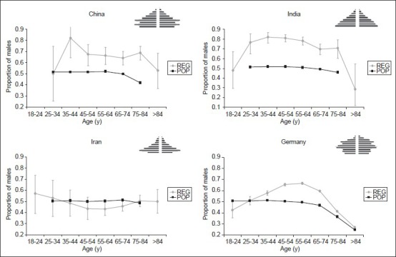
Figure 4.

Graphs showing the gender distribution of stroke patients from four different countries. Black lines: Proportion of males in the respective general populations. Grey lines: Proportion of males as derived from stroke registries Black lines: Proportion of males in the respective general populations. Grey lines: Proportion of males as derived from stroke registries
