Figure 4.
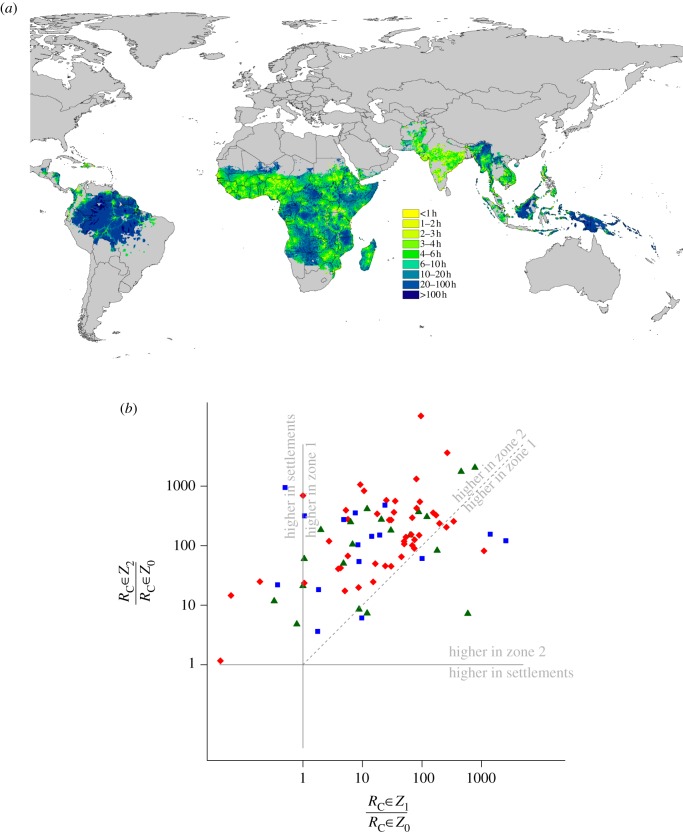
(a) Estimated travel time to the nearest settlement of population more than 100 000 [106] within the contemporary limits of P. falciparum transmission [95]. (b) Scatterplot comparing mean ratios of RC values for settlements (zone 0 or Z0) compared with areas in zone 1 outside of settlements but less than 4 h travel time from a settlement (Z1), and compared with areas in zone 2 greater than 4 h travel time from settlements (Z2). Each dot represents a country and blue squares are for the Americas, red diamonds for Africa and dark green triangles for Asia. Two one-to-one comparison lines are added and annotated to show regions of the graph where transmission is higher in settlements than either zone 1 or zone 2. Above the diagonal dashed line, transmission is higher in zone 2 than zone 1. The general pattern is that RC values tend to be in the upper triangle: lowest in settlements, and highest more than 4 h travel time from settlements. Those in the upper triangle have the greatest potential for ‘stickiness’.

