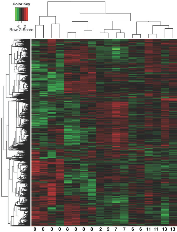
Figure 4.
Hierarchical clustering of gene expression values in four control and 14 extract treated samples. Genes (rows) were clustered based on their distance in Pearson product–moment correlation (left dendrogram); arrays (columns) were clustered based on their distance in using Spearman rank correlation (top dendrogram). Numbers at the bottom of the figure indicate the identity of the arrays: 0, control, 8, China 8; 2, USA2, 7, USA7; 6, USA6; 11, Europe11; 13, India13. The expression levels (log2 transformed, see Methods for details) were scaled to the row mean. The color key indicates how the heat map colors are related to the standard score (z-score), i.e. the deviation from row mean in units of standard deviations above or below the mean.

