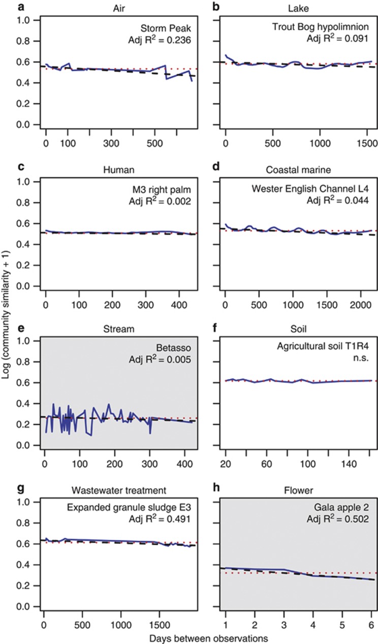
Figure 4.
(a–h) An example of time-decay from each microbial habitat. White chart background shows that the model was fit using weighted UniFrac distances and gray shows that the model was fit using unweighted UniFrac distances. Note differences in x axis ranges. The blue line is the smoothed series of community similarities, the dotted red line is the overall mean similarity and the dashed black line is the log-linear time-decay model. NS, not significant.

