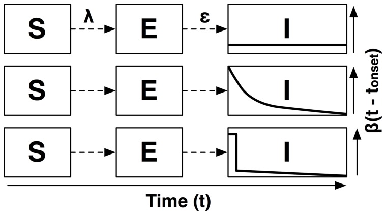
Figure 2. Illustration of model structure for Models 1, 2 & 3.
The figure illustrates the change in infectiousness over time, for Model 1 (SEIR; top), Model 2 (Exponential decay; middle) and Model 3 (Burst; bottom).  is the force of infection, i.e. the rate at which susceptible individuals are recruited to the latent class, E, and
  is the mean rate at which infected individuals progress to infectiousness. The asymptomatic class, A, and recovered class, R, are omitted from the figure for visual clarity.

