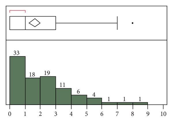
Figure 3.

Derivation cohort: sum of the absolute value of the difference between the automatic and manual SOFA component scores. For the outlier box plot, the first box (red bracket) represents the first quartile, followed by the second and third quartiles. Fourth quartile outliers are represented by black dots. The triangle represents the mean difference (1.64).
