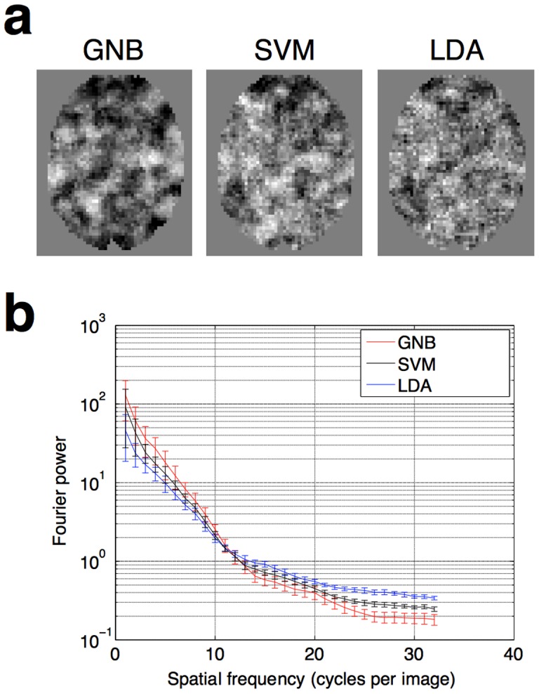
Figure 4. Comparison of the smoothness of searchlight maps generated by different classifiers.

(a) Illustrative slices drawn from one individual. It can be seen from a simple visual comparison that the smoothest information maps arise from using GNB classifiers, which do not model covariance. (b) A quantitative comparison, showing Fourier power of the different images at a range of spatial frequencies, averaged across all 13 subjects. Images that are less smooth have more “salt and pepper” noise, and therefore have more power in the higher spatial frequencies. Error bars show the standard error of the mean, across the 13 subjects. The curves are statistically significantly different from each other (two-sample t-test, p<0.05) for spatial frequencies of 21 cycles per image and over.
