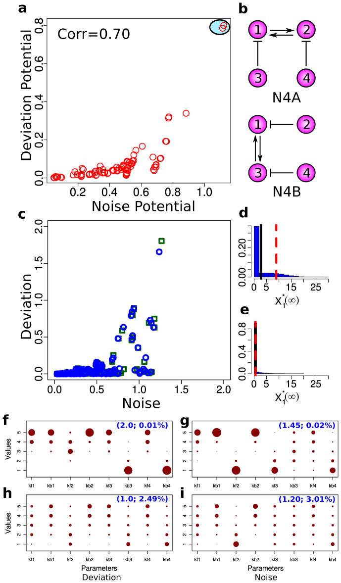
Figure 2. Deviation and noise levels of four-node networks.
(a) A scatter plot showing the potential for high deviation and noise levels. Here, each red open circle represents the average of the ten highest noise levels (x-axis) and the average of the ten highest deviation levels (y-axis) from each network. The red circles surrounded by the light blue oval represent the two topologies with the highest deviation and noise levels. (b) The network structures that give the highest deviation and noise potential (N4A top and N4B bottom). Note that N4A and N4B are isomorphic with respect to node 1. (c) Correlations between the noise level and the deviation level of N4A and N4B. Each data point represents the noise and deviation level of one of the two networks (blue circles for N4A and green squares for N4B) for a specific parameter combination. (d) A distribution of  that gives the highest level of deviation from N4A. (e) A distribution of
  that gives one of the highest levels of variability and a low level of deviation from N4A. (f)–(i) The distributions of the parameter combinations, each of which results in the deviation level or the noise level reaching a specified threshold value. The two numbers in the parentheses in each panel indicate the threshold value (left) and the fraction of the total samples that reach this value (right).

