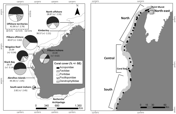
Figure 2. Map of study Western Australian coral monitoring sites showing: A) Dominant coral family composition for each sampling region and absolute coral cover (% ± SE), and B) Ningaloo Reef with survey sites (), where light grey shadow area denotes Ningaloo Marine Park boundary.
The size of pie charts is relative to overall percentage of total absolute coral cover. Pie charts represent contribution of dominant coral families relative to one another for each region. Lines connect pie charts with corresponding regions. Coral cover and composition for regions within Western Australia based on the last 10 years of data collected.

