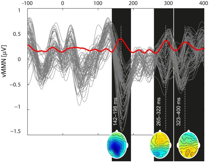
Figure 3.
Butterfly plot of the grand mean deviant-standard difference waveform at all channels including the vMMN (gray traces) and its global mean power (red trace) demonstrate the temporal dynamics of the vMMN. Three local extremes around which the intervals of interest were selected (142–198, 265–332, and 324–400) are marked as black rectangles. For the time points indicated by a white dotted line, potential distributions are plotted at the bottom of the appropriate rectangles.

