
Figure 5. Equivalence contours.
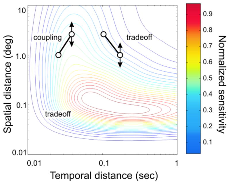
The colored curves are the contours of contrast sensitivity reproduced in the distance graph from the spatiotemporal frequency graph of Kelly (1979), using methods explained in Gepshtein and Kubovy (2007). Contour slopes vary across the graph, consistent with the regimes of coupling and tradeoff of apparent motion in different parts of the graph. The two pairs of connected circles are two examples of where different regimes of apparent motion are expected if strength of apparent motion was predicted by contrast sensitivity.