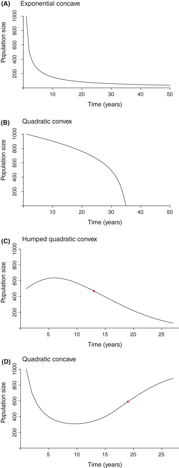
Figure 4.

Decline patterns found in wildlife populations, associated with (A) simulated constant proportional pressure, (B) increasing fixed pressure (C) increasing proportional pressure starting far from K, and (D) decreasing proportional pressure. Red dots represent switch point (SP) locations. Where applicable, each graph title corresponds to the best-fit function of the first SP-delimited section.
