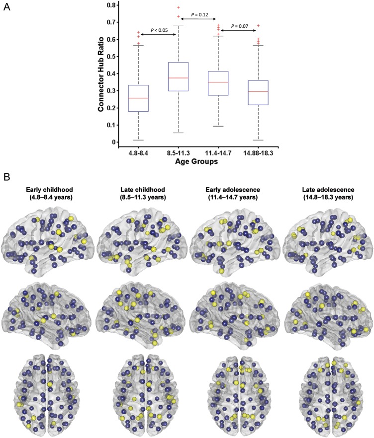
Figure 6.
Developmental changes in connector hub distribution. (A) Statistical comparison of connector hubs for the age groups using 1000 bootstrap samples. Student's t-test is used for checking significance between 2 age groups. (B) Connector hub distribution for the age groups. Yellow ones represent cortical regions that are identified as connector hubs (with participation index, P > 0.62; for details, see Materials and Methods), while blue ones are the rest of the cortical regions.

