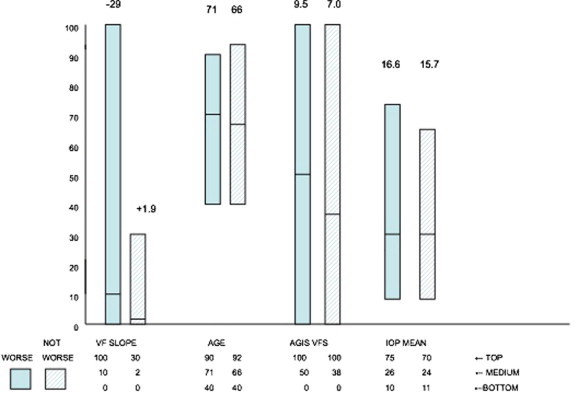
Figure 4.

Individual data points from the analysis made by Caprioli in Fig. 3, analyzing those patients whose visual fields got worse and those who did not get worse in four categories, specifically related to the rapidity of worsening visual field, the age of the patient, the amount of visual field loss, and the mean intraocular pressure. The dark bars are those who developed visual field loss, and the light bars those who did not. The figures at the top of each bar are the mean values. The units on the Y-axis represent the ranges, adjusted so as to have a similar denominator. Zero represents the lowest value and 100 the highest.
