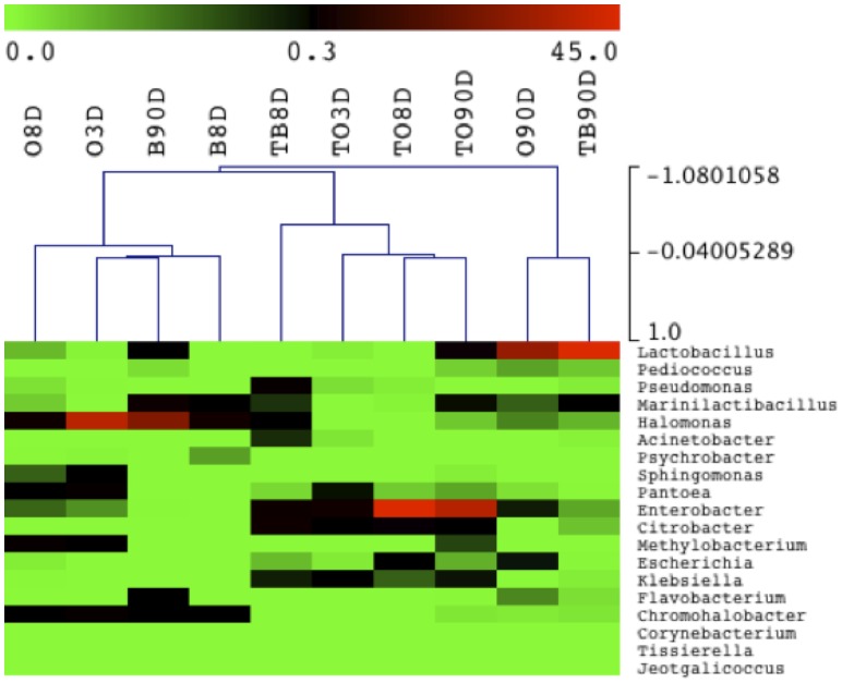
Figure 4. Heat map depicting bacterial diversity and relative abundance in treated (T) and untreated olives (O) and brines (B) during fermentation.
Numbers in the samples identity indicate the days of fermentation. Hierarchical dendrogram shows distribution of samples based on average linkage clustering calculated with Pearson correlation. Legend and color scale shown in the upper part of the figure represent colors in the heat map associated with the relative percentage of each OTU within the samples.

