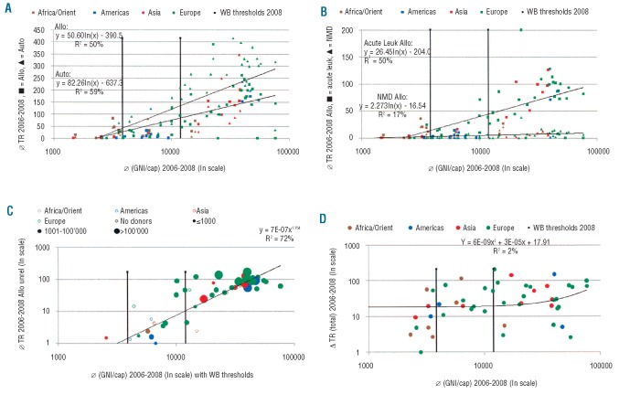
Figure 3.
Transplant rates and Gross National Income per capita (GNI/cap). (A) Transplant rates for allogeneic and autologous HSCT by WHO regional offices area, donor type and GNI/cap. Symbols reflect transplant rates (TR; numbers of HSCT by 10 million inhabitants) in participating countries and the respective lnGNI/cap. Colors indicate WHO region (see Figure 1); squares indicate allogeneic HSCT, triangles autologous HSCT. Vertical lines separate countries by World Bank (WB) category. (B) Transplant rates for allogeneic HSCT for acute leukemia and non-malignant disorders by WHO regional offices areas and GNI/cap. Symbols reflect transplant rates (TR; numbers of HSCT by 10 million inhabitants) in participating countries and the respective lnGNI/cap. Colors indicate WHO regional offices areas (see Figure 1); squares indicate acute leukemia, triangles non-malignant disorders. Vertical lines separate countries by World Bank category. (C) Unrelated donor transplant rates by WHO regional offices areas, GNI/cap and presence of an unrelated donor registry. Symbols represent transplant rates; open symbols indicate absence of an unrelated donor registry, full symbols the presence of such a registry and size of symbols numbers of its registered donors. Colors indicate WHO region (see Figure 1). Only countries with unrelated donor HSCT are included. (D) Change in transplant rates (all transplants) from 2006 to 2008 by GNI/cap and WHO regional offices areas. Symbols represent increase or decrease in transplant rates (TR) from 2006 to 2008; colors indicate WHO regional offices areas (see figure 1).

