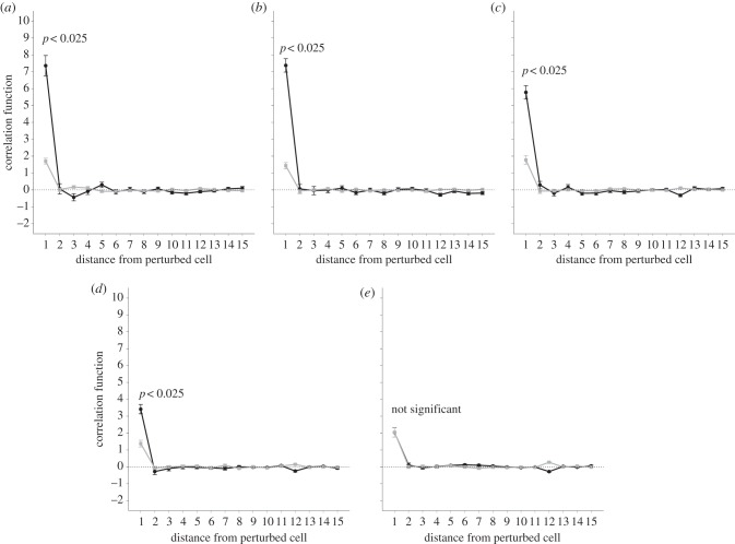
Figure 8.
Correlation function versus increasing distance from the stimulated cell. Points show mean ± s.e.m. of 100 simulations. The darker lines correspond to networks with fewer than 10 per cent of cells becoming excited. The paler lines correspond to networks with more than 90 per cent of cells becoming excited. The initial perturbation is kept constant at 1. Each graph represents a different probability of connections existing between any two given cells. (a) Probability = 0.6, (b) probability = 0.7, (c) probability = 0.8, (d) probability = 0.9, (e) probability = 1.

