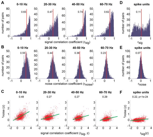
Figure 3.
A. The histogram of signal correlations between all pairs of LFP channels (N=2025) were simultaneously recorded. LFP correlations were computed separately for each of the 8 frequency bands (only 4 bands are shown). The red line and the abutting number indicate the mean of the distribution. B. The histogram of LFP noise correlations. C. Signal correlation versus noise correlation. Each dot represents an individual LFP pair. The correlation coefficients are z-transformed. The green lines represent the linear regression. Spearman’s correlation between the two correlations is marked on the top of each plot. The significance level was virtually zero. D–F. The same as A–C but for all pairs of spike units (N=2243).

