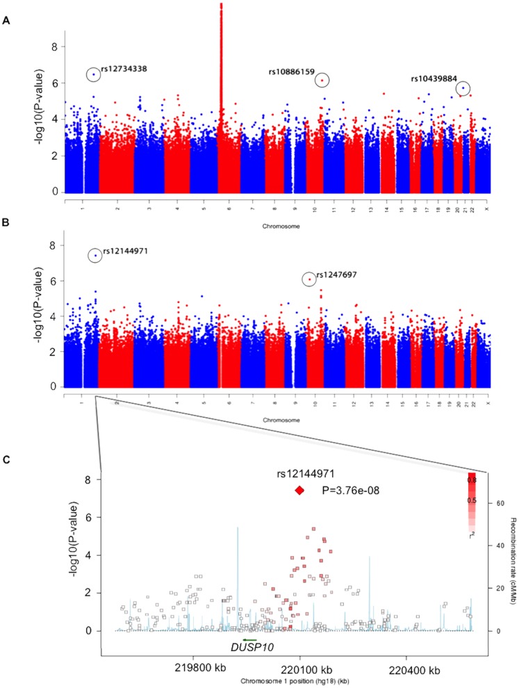
Figure 1. Manhattanplot of the TDT p-values.
a) The location of all genotyped SNPs on chromosomes 1–22 and X plotted on the x-axis. –log10(p-value) result for each SNP and all transmissions on the y-axis. b) The location of all genotyped SNPs on chromosomes 1–22 and X plotted on the x-axis. –log10(p-value) result for each SNP and all transmissions, to children in the low risk group, on the y-axis. c) Regional plot of association results and recombination rates, within the region surrounding DUSP10, generated by SNAP (http://www.broadinstitute.org/mpg/snap/ldplot.php). The x-axis show 500 kb around the most associated SNP. Genomic locations of genes within the region of interest (NCBI Build 36 human assembly) were annotated from the UCSC Genome Browser (arrows). The left y-axis show –log10(p-value) and estimated recombination rates (cM/Mb) from HapMap Project (NCBI Build 36) are shown in light blue lines.

