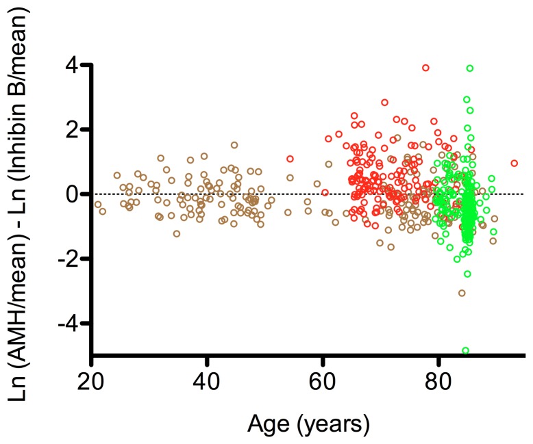
Figure 5. The ratio of AMH and InhB in the cohorts of community dwelling men.
The Otago cohort is represented by brown open circles (n = 205), the vascular cohort by red open circles (n = 153) and the LiLACS NZ cohort by green open circles (n = 257). Each open circle represents an individual. An increasing divergence was seen in the older age groups. The vascular cohort had an AMH bias. The ratio of the hormones across the age spectrum was calculated as described in the Methods.

