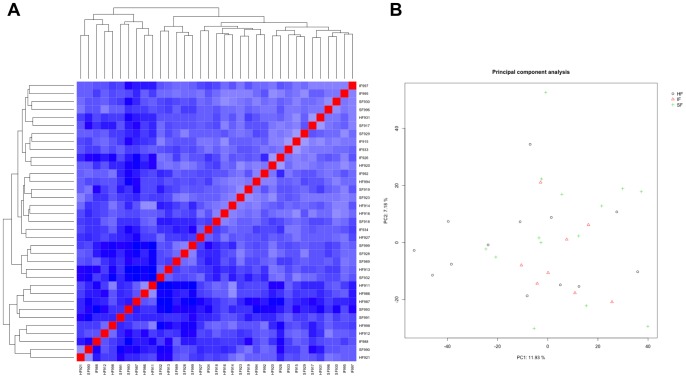
Figure 3. Heatmap of pairwise correlations and principal component analysis (PCA) of microarray data.
(A) Microarray data were filtered for detectable probes and normalized with the BioConductor package vsn. Normalized data were used for calculation of pairwise distances and drawing of a heatmap by use of the BioConductor package geneplotter. Each column represents one sample and shows the correlation to all samples (including itself), with red for correlation = 1 and blue for the lowest observed correlation. Note the clear homogeneity in the samples from fertility classified heifers (HF, high fertile; SF, subfertile; IF, infertile). (B) PCA is a plot distribution indicating the source of greatest variation in the overall transcriptional profiles of the samples. Each symbol represents one replicate. Note the clear lack of separation of samples based on fertility classifications (HF, high fertile; SF, subfertile; IF, infertile).

