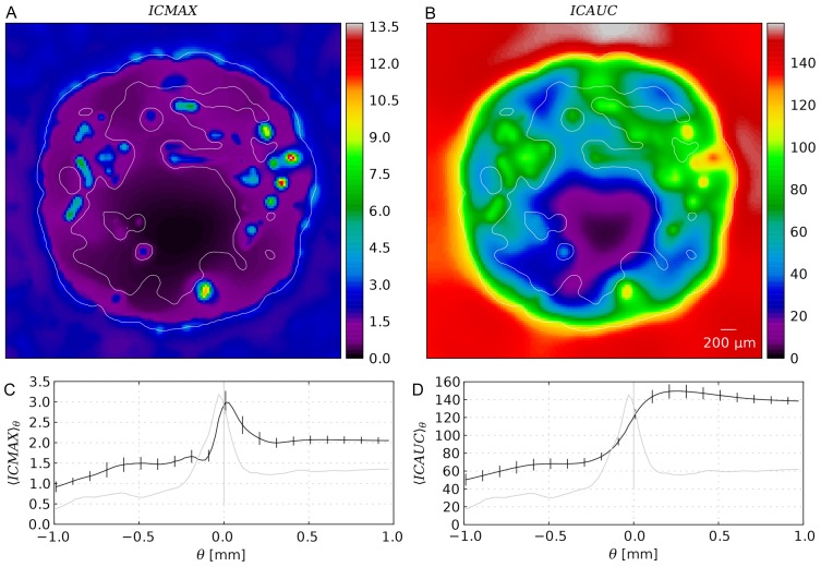
Figure 9. Spatial distributions of drug exposure metrics.
(A) Snapshot of the intracellular maximal concentration  , and (B) snapshot of the time integrated concentration
  from a typical simulation result from the base case. The contours delineate the viable tumor mass. (C) and (D) Plots of
  and
and  from the base case as ensemble averaged (15 systems) radial distributions (black) similar to Figure 5. In addition, the vessel volume fraction is plotted as well (grey).

