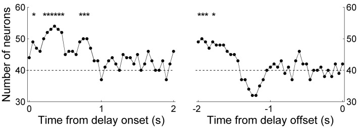
Figure 9.
Comparison of neural activity related to the previous and upcoming goal choices. The graphs show the number of neurons whose activity is better explained by the animal's previous than upcoming goal choice (Equation 2 vs. Equation 3; 1-s window advanced in 50-ms steps). The dashed horizontal line indicates equal distribution (50%). The first data point of the left graph (time from delay onset) corresponds to the first 1 s of the delay period, and the last data point of the right graph (time from delay offset) corresponds to the last 1 s of the delay period. Asterisks indicate significant difference from chance level (χ2-test, p < 0.05).

