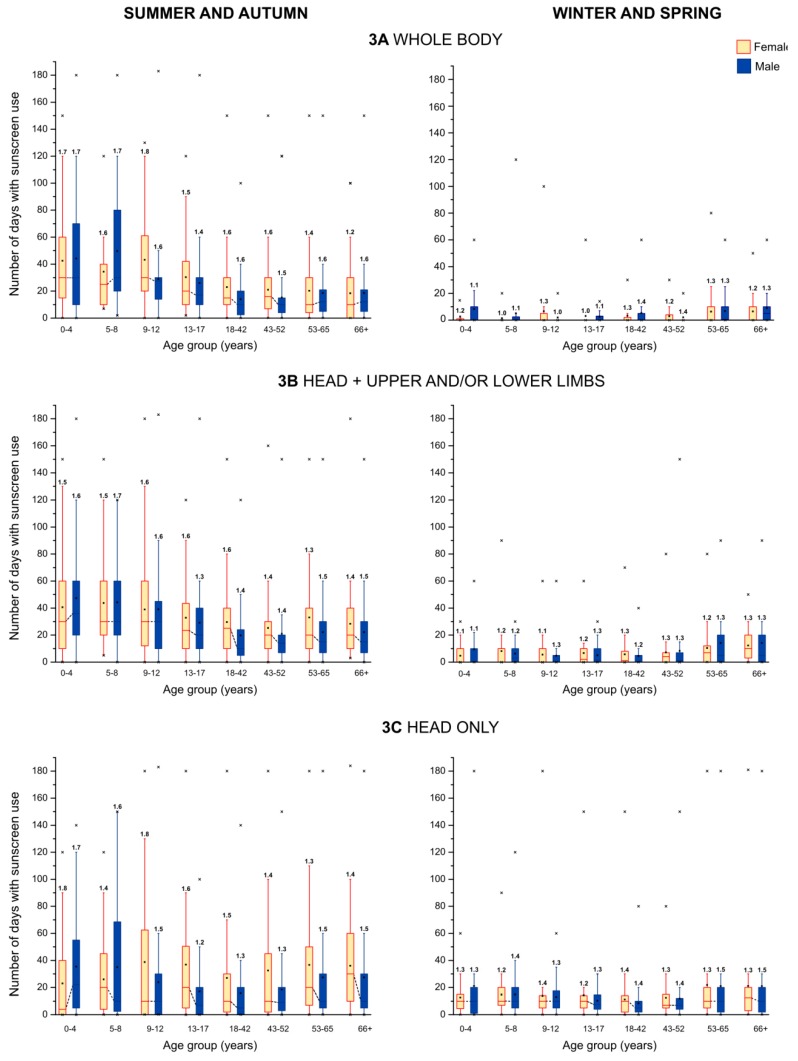
Figure 3.
Distributions of frequency of sunscreen use to different body areas across age and gender groups. In each box plot, the lower and upper edges of the box represent the 25th percentile and the 75th percentile, respectively, the square indicates the mean, and the solid horizontal line the median. For better comparison, the medians between genders within each age group are connected by a dotted line. The vertical lines represent the 5th and 95th percentiles of the respective distribution. Outliers are displayed as crosses. The mean (arithmetic) number of sunscreen applications per day is displayed above each box.

